Introduction
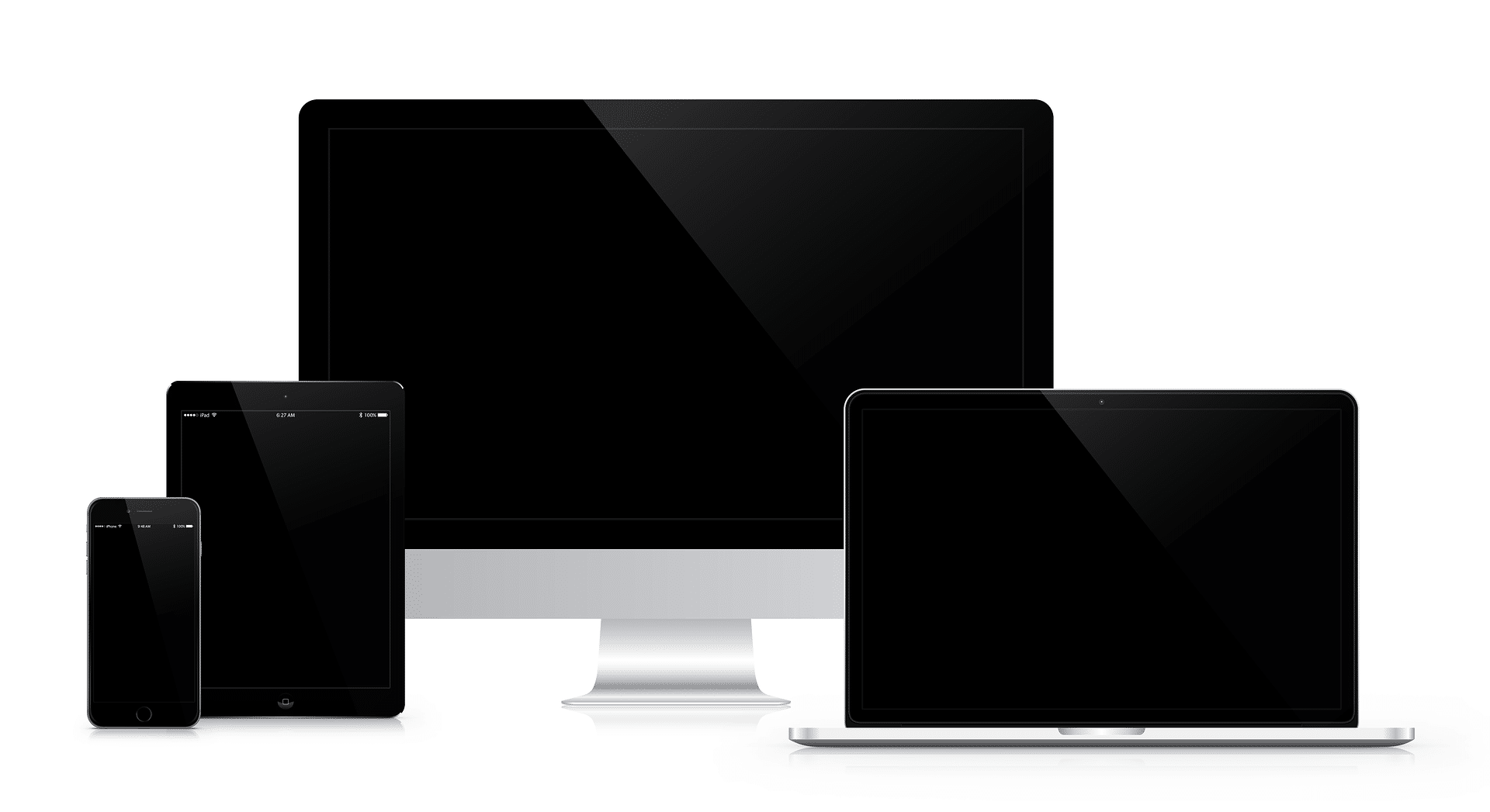
In your pursuit of a responsive website, you will explore the core principles that form the foundation of responsive design. In this article, you will learn how flexible grids, images, and CSS media queries constitute the backbone of every responsive website, dynamically adjusting the layout to the viewport size — as opposed to adaptive websites that use fixed layouts for specific viewport sizes.
We will highlight the benefits of responsive web design, shed light on the challenges, and provide you with best practices for implementation. You will gain insights into useful tools and frameworks and take a glimpse into the future of CSS responsive design.
With over 48% of the top 500 most visited e-commerce sites using responsive design, it’s clear that RWD is more than just a trend – it’s an essential component of modern web development, pioneered by Ethan Marcotte, who laid the groundwork in 2010.
Principles of Responsive Web Design
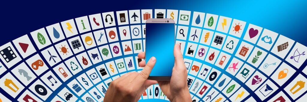
Responsive Web Design (RWD) is a crucial approach in web development that aims to create websites that adapt to various devices and screen sizes. With over 80% of Germans regularly online and 55% regularly using mobile internet, RWD has become indispensable.
- 1. Fluid Grids:
- Elements on the website are proportionally scaled to adapt to any screen size.
- Instead of using fixed pixels, elements are specified in relative units such as percentages, allowing for greater flexibility on different devices.
- 2. Flexible Images and Media:
- Images and media content seamlessly scale to maintain high quality on different output devices.
- Techniques like CSS functions max-width ensure that images are not displayed larger than their surrounding elements.
- 3. CSS Media Queries:
- Enable designers to apply different styles for different devices, ensuring optimal display and user-friendliness.
- By defining breakpoints, specific CSS styles can be applied for certain screen sizes to ensure the best possible layout.
When planning for RWD, evaluate the performance of the current website design on various devices, define design goals and requirements based on user needs and business objectives, and develop a content strategy tailored to user needs.
In the implementation phase, choose a responsive design framework, design for multiple screen sizes with flexible grids, element placement, and typography, implement responsive images and media that adapt to screen sizes, and test the design on various devices.
Prioritize important content for mobile devices, optimize page loading speed for mobile devices, improve mobile navigation with hamburger menus or similar solutions, and regularly test and update the design to integrate new best practices and features.

The Benefits of Responsive Web Design
Responsive Web Design adapts to various screen sizes, ensuring optimal display on all devices. This not only simplifies the user experience for mobile device users by adjusting content to fit screen size but also reduces the effort required for content updates, minimizing the risk of inconsistencies. With a single URL for all devices, you also improve search engine optimization and make content sharing easier.
- Search Engine Optimization: Using one URL for all devices simplifies the indexing process for search engines, improving SEO performance.
- User Experience: Content that dynamically adjusts provides a seamless experience across all devices, enhancing usability.
- Maintenance Effort: Having a single responsive design means you only need to maintain one version of your website, saving time and resources.
Google recommends Responsive Web Design due to its resource efficiency and improved mobile user experience. With consistent design and interaction across devices, it becomes easier for users to navigate. The need for separate mobile app development or multiple versions of the same website for different devices is eliminated, leading to cost savings.
- Cost Savings: No separate app development or multiple website versions necessary, reducing costs.
- Brand Image: A professionally designed, responsive website leaves a positive first impression and strengthens trust in your company.
Optimized mobile websites can lead to higher sales as more users are inclined to complete purchases on mobile-friendly pages. Responsive websites convey a professional image and make your company appear more trustworthy.
- Sales Promotion: A website optimized for mobile devices promotes purchase completion and can increase revenue.
- Professional Appearance: Responsive design enhances your company’s reputation and fosters user trust.
By implementing Responsive Web Design, you position your company as progressive and user-focused, ultimately leading to stronger customer loyalty and higher conversion rates.
Challenges and Best Practices
Responsive Web Design (RWD) is a crucial approach to ensure that websites adapt to various screen sizes and devices to provide optimal viewing and interaction. Although RWD offers many benefits, such as improved user experience, conversions, customer retention, and search engine rankings, there are challenges to overcome. Here are some best practices to help you address these challenges:
Challenges
- Implementation Complexity: Implementing a flexible layout that works on a variety of devices requires a deep understanding of CSS and HTML, as well as an eye for design.
- Performance-Optimization: Load times are crucial for user experience. Large images and media content need to be optimized to ensure fast loading times.
- Testing und Debugging: It is necessary to test the design on a variety of devices and browsers to ensure it displays correctly everywhere and is user-friendly.
Best Practices
- Flexible Layouts and Grids: Use percentage values instead of fixed pixel values for widths, margins, and paddings to achieve greater adaptability.
- Focus on the most important content and features for smaller views to improve the user experience on mobile devices.
- Utilize Media Queries: Define breakpoints to apply specific styles based on viewport width and finely tune the layout for different devices.
Optimization and Testing
- Responsive Images: Use the srcset attribute and the sizes attribute to deliver appropriate image sizes depending on the viewport width.
- Responsive Typography: Adjust font sizes and line heights based on viewport width to ensure readability on all devices.
- Mobile Navigation: Implement a mobile navigation hidden behind a hamburger icon or similar solution on smaller viewports using CSS transitions or animations.
- Performance Optimization: Optimize images, minimize CSS and JavaScript, and utilize browser caching to achieve fast loading times on all devices.
- Accessibility: Accessibility
By applying these best practices and keeping an eye on new technologies and trends in RWD, you can ensure that your responsive design remains effective and appealing not only today but also in the future.
Tools and Frameworks
When building your responsive website, you’ll come across a variety of tools and frameworks that can simplify and expedite the process. Here are some of the leading resources you should consider:
Bootstrap:
- Grid System: Bootstrap features an extensive 12-column grid system that automatically adjusts to screen size.
- Components: Use predefined components like navigation bars and forms to save time.
- Plugins: Expand your website with JavaScript plugins to integrate interactive elements like dropdowns and modals.
Foundation:
- Flexibility: Known for its flexibility, Foundation allows you to scale your site’s design with a responsive grid and UI elements.
- Scalability: No matter the size of your project, Foundation adapts to your needs and grows with your requirements.
Bulma:
- Flexbox-Based: Bulma leverages the advantages of Flexbox for a modern and flexible layout.
- Modular: Choose only the components you need to keep your design slim and fast.
Materialize:
- Material Design: Apply the principles of Material Design for an appealing user interface.
- Customizable: Tailor Materialize to your brand identity with pre-built components and plugins.
Skeleton:
- Minimalistic: Skeleton is perfect for projects that need a lightweight CSS framework without unnecessary bulk.
- Base Styles: Benefit from basic styles for quick and easy website styling.
PureCSS:
- Lightweight: PureCSS is a set of responsive CSS modules, ideal for performance-focused projects.
- User-Friendly: The modules are easy to understand and use, speeding up development.
Tailwind CSS:
- Utility-First: Another approach that allows you to quickly create unique designs without breaking the mold.
- High Customizability: Tailwind CSS gives you the freedom to customize almost every aspect of your design.
Susy:
- Sass Toolkit: Create custom grids and responsive layouts tailored to your exact requirements with Susy.
PostCSS:
- CSS Transformation: Use JavaScript to transform your CSS and add features like autoprefixing and minification.
Gulp und Grunt:
- Automation: Automate recurring tasks like Sass compilation and image optimization to work more efficiently.
- Optimization: Improve your website’s performance by minimizing CSS and JavaScript.
Webpack:
- Module Bundling: Manage and optimize your assets, including JavaScript, CSS, and images.
- Code Splitting: Enhance loading times through code splitting and minification.
By integrating these tools into your development process, you can ensure that your responsive design is not only functional but also future-proof. With the right set of tools and frameworks, your responsive web design project will not only be more efficient but also more effective.
By relying on proven solutions, you can focus on creating an exceptional user experience that will delight your visitors.
Future of Responsive Web Design
In the world of Responsive Web Design (RWD), groundbreaking developments are on the horizon that will redefine user expectations. Here are the future trends to keep an eye on:
- Mobile-First Design:
- This approach puts mobile devices at the forefront of the design process, going beyond traditional RWD.
- User experience is tailored specifically for smartphones and tablets by leveraging features like device detection and context-based content delivery.
- Adaptive Design:
- As an extension of Mobile-First Design, Adaptive Design is expected to gain increasing importance.
- It provides tailored experiences precisely tuned to different devices and screen sizes.
- User Experience (UX):
- UX remains a central element, with immersive technologies like Virtual Reality (VR) and Augmented Reality (AR) becoming increasingly popular in RWD.
The integration of Artificial Intelligence (AI) and machine learning in RWD enables personalized user experiences that adapt to the individual needs and preferences of users. This creates unprecedented interaction and user engagement.
Another trend gaining traction in the web design industry is sustainable design. This focuses on energy efficiency and environmentally friendly practices. It is expected that this movement will also influence RWD by promoting the development of websites that are not only user-friendly but also environmentally conscious.


