Define the Purpose and Audience of the Brochure
Before you start designing your brochure, it is essential to clarify two key aspects: the purpose and the target audience. These two factors form the foundation for an effective and targeted brochure.
Purpose Definition
Every successful marketing campaign begins with a clear goal. Ask yourself: What do you want to achieve with your brochure? Should it generate leads, promote your product or service, or simply convey information? Define a measurable metric you want to increase with your brochure, such as visits to your store or sign-ups for your newsletter.
Target Audience Analysis
Before you begin designing, a comprehensive target audience analysis is crucial. The goal is to better understand your potential customers and identify their needs and interests. According to a Nielsen study, personalized and relevant advertising materials are 80% more effective than generic ones. By knowing your target audience well, you can tailor your message to their desires and significantly increase the effectiveness of your printed materials.
Consider the following questions to better understand your target audience:
- What demographic characteristics like age, income, and location are relevant?
- What interests and lifestyles characterize your target audience?
- At what stage of the buying cycle are they?
- What challenges or needs do they have that your product or service can solve?
Go through the questions calmly and best write down the results directly. The better you know your target audience, the more effectively you can tailor your brochure to their needs.
Develop the Content of Your Brochure
Structure and Layout
Arrange the contents of your brochure to build and create a suspense arc. Storytelling can be helpful in image brochures – tell a story that reaches its finale on the penultimate page. On the last page, then prompt readers to take action.
The first headline is the most important as it shapes the cover page. Try to create a visual “eye-catcher” here.
Textgestaltung and Call-to-Action
Pay attention to the wording depending on the brochure type and target audience. A product brochure for end customers should be more emotional and engaging, while an image brochure for decision-makers should be more sober. The general rule is: as short as possible, but as comprehensive as necessary.
Pictures can be emotional triggers for end customers, while infographics and charts provide essential guidance for decision-makers.
Integrate a clear call-to-action (CTA) that prompts the reader to take action – e.g., order a product, sign up for a newsletter, or schedule a consultation. The CTA should stand out visually but still be harmoniously integrated into the corporate design. Formulate it precisely and convincingly, without being too intrusive.
Insert Visual and Graphic Elements
Flyers and brochures without pictures? Unimaginably boring. Only photos and pictures make classic print products and your website eye-catching. Pictures and photos inform, inspire, and motivate purchase. In online shops, you make products sensually experienceable, on advertising posters, you catch the eye from afar, and in company brochures, you emphasize a specific image. Therefore, you should use pictures and photos in your advertising and information materials – but legally compliant!
Use of Photos and Illustrations
Obtain the photographer’s permission to use their photos, entering into a license agreement. As a licensee, you receive usage rights to the work. You may now use the selected photos on your website, in your brochure, or flyer. There are numerous image databases offering royalty-free pictures. A vast pool of thousands of images and photos on various topics is available.
Present your photos and pictures particularly high-quality on photo books, which come in many different sizes and formats. If you are looking for large formats, canvases on stretcher frames are the first choice. These artist canvases with high-quality cotton fabric perfectly showcase your motifs. Your works also look great on custom-sized wallpapers or posters.
Pay attention to the quality of photos and graphics. More than in web design, high-resolution photos and professionally created graphics are important for print. Unfortunately, printed photos are not forgiving if the resolution is insufficient. Remember to create photos and graphics for print in the CMYK color space (as opposed to the RGB mode used on the web).
Color Scheme and Fonts
To structure the brochure clearly and simply, it is very helpful to use a baseline grid, a format grid, and guidelines to systematically design texts, images, and white space. Plan enough white space to ensure the brochure is not overloaded and remains clear.
If the font is not yet determined in the style guide, use an easily readable one because you want the contents of your brochure to be quickly and easily grasped. In general, never use more than two font families to avoid a chaotic appearance. Set a main font for the body text that you use consistently. To highlight headings, you can use an additional bold font. Do not vary too much in font size either. Assign a size to each text level/type, therefore set a specific font size for all elements from the section to the headline, caption, and page number. For the body text, a font size of 9 to 10.5 points is recommended.
Fonts significantly influence brand perception and identity. Sans-serif fonts convey a sense of modernity, simplicity, and cleanliness. They are versatile and well-suited for minimalist designs. Serif and display fonts convey a sense of tradition, sophistication, and reliability. They are ideal for brands that want to communicate a sense of tradition and craftsmanship. Experimental and mixed-weight typography has a unique and edgy appeal. They are perfect for brands that want to stand out and make a bold statement. Combining a decorative script font with a simple sans-serif font creates a refined and elegant look. This combination is suitable for luxurious or feminine brands. Combining an experimental font with a classic serif font creates an interesting contrast. This combination is perfect for brands that want to make a bold statement while maintaining a sense of sophistication.
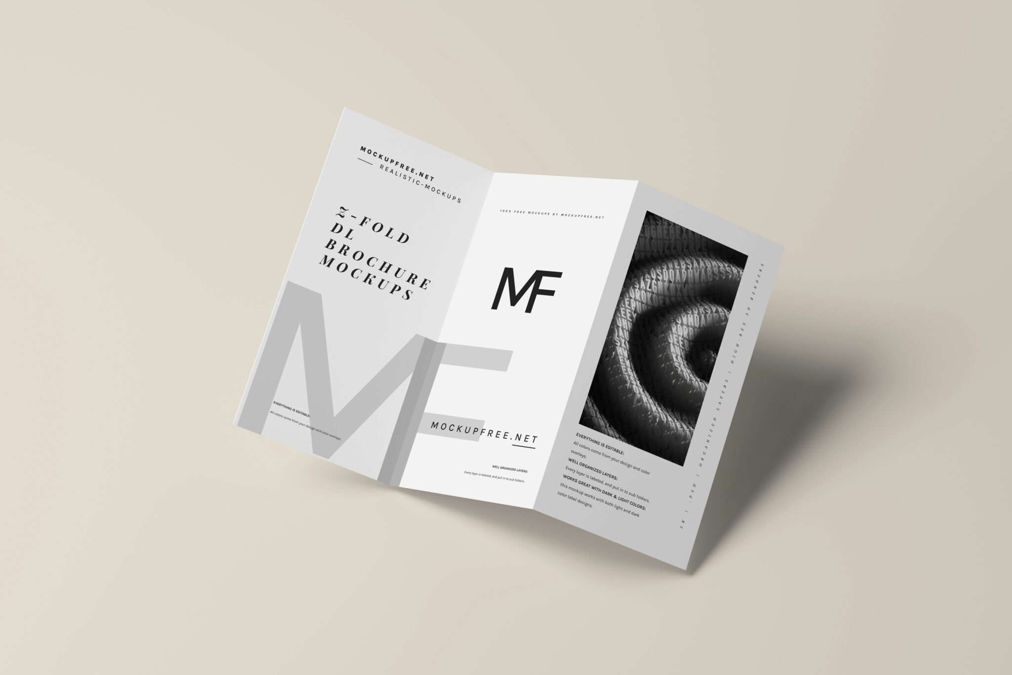
Choosing the Right Folding Method
The folding method you choose for your brochure affects not only its appearance but also how your content is presented. Here are some popular folding types and their pros and cons:
Popular Folding Types
- Single Fold: This classic folding method is ideal for brochures with few pages. The paper is folded in the middle, so the pages are inside. This fold is simple and cost-effective to produce.
- Roll Fold: In a roll fold, the paper is folded several times in parallel, allowing the pages to open like an accordion. This fold is suitable for longer brochures and allows a clear presentation of many contents.
- Zigzag Fold: Here, the paper is alternately folded left and right, creating a zigzag structure. This fold gives your brochure a dynamic and modern look.
- Perfect Binding: For more extensive brochures with more than 96 pages, perfect binding is recommended. The pages are held together at the spine with flexible adhesive, allowing easy opening.
Pros and Cons of Different Folds
Each folding method has its own strengths and weaknesses, which you should consider in your decision:
- The single fold is cost-effective but limited to a few pages.
- The roll fold offers more space for content but can appear cluttered.
- The zigzag fold gives your brochure a modern look but can be difficult to fold.
- Perfect binding is suitable for extensive brochures but more expensive to produce.
Ultimately, the right folding method depends on the length, content, and desired appearance of your brochure. Carefully consider which fold best meets your requirements.
Select and Customize a Template
When creating a brochure, choosing the right template is crucial. A good template saves time and effort and ensures that your brochure looks professional and appealing. Here are some tips on finding and customizing the perfect template.
Analyze Template Options
There are numerous websites offering free or paid brochure templates. Some popular options are:
- Canva: Offers a free basic plan with hundreds of brochure templates for various purposes.
- Lucidpress: With over 800 brochure templates, you can create a brochure that stands out.
- Flipsnack: Provides free brochure templates for various industries such as business, fashion, travel, marketing, and more.
- Template.net: Offers over 100,000 pre-made templates, including many brochure templates.
Carefully analyze the templates and choose one that matches your branding, target audience, and content. Pay attention to aspects such as layout, color scheme, fonts, and space for images and text.
Customization Techniques
After finding a suitable template, it’s time to customize it to your needs. Here are some techniques you can apply:
- Adjust Colors: Adapt the template’s colors to your corporate design by changing the color palette.
- Replace Fonts: Replace the existing fonts with your own brand fonts to achieve a consistent look.
- Replace Images and Graphics: Substitute placeholder images and graphics with your own visual elements that fit your brand and content.
- Customize Text: Adapt the template’s text by replacing it with your own content and adjusting the formatting.
- Adjust Layout: Modify the template’s layout by moving, adding, or removing elements to meet your requirements.
Remember to customize the template to match your brand and content without losing the basic structure and design that made the template attractive.
Conclusion
Creating an engaging and effective brochure requires careful planning and execution. By defining the goal, target audience, and content in advance, you lay the foundation for a targeted brochure. The correct selection and customization of visual elements such as photos, graphics, colors, and fonts are crucial to capturing your readers’ attention and effectively conveying your message.
By considering aspects such as folding method and template selection, you can ensure that your brochure is not only aesthetically pleasing but also practical and user-friendly. By following these tips and guidelines, you can create a brochure that effectively represents your brand, appeals to your target audience, and meets your marketing goals.