Pay attention to the design of the notes master
Importance of the notes master for creating handouts
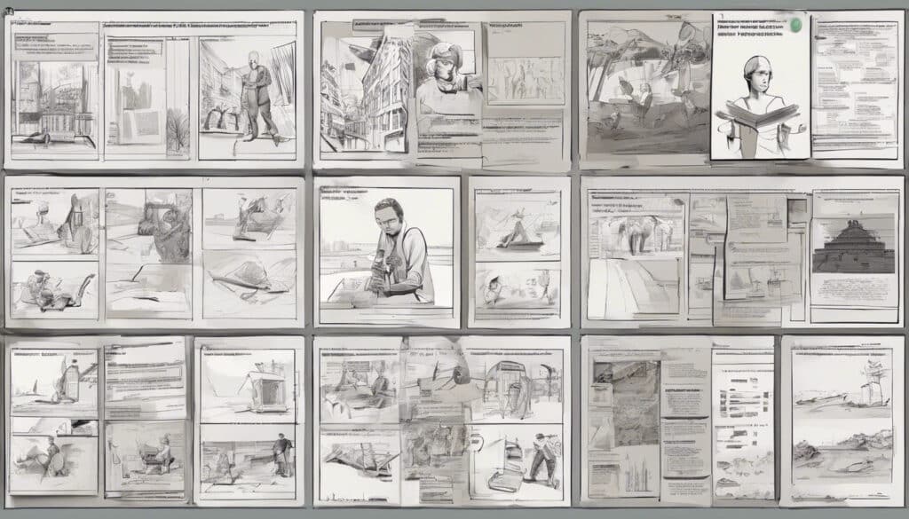
The notes master in PowerPoint is an important tool for creating professional handouts for your presentation. It allows you to customize the layout and formatting of the notes pages that you can later print or distribute as a PDF file. The notes pages usually display a thumbnail of the slide and an area for your notes.
Designing the notes master for an attractive handout design
- Adjust layout: In the “Page Setup” group, you can set the layout of the notes pages. Here you can configure the number of slides per page, the orientation (horizontal or vertical), and the slide size according to your preferences.
- Edit headers and footers: In the “Placeholder” group, you can add or edit headers and footers on the notes pages. For example, you can insert the title of the presentation, the date, or the page numbers.
- Background and effects: Using the “Background” group, you can change the background of the notes pages. Choose a color, pattern, or image that matches your presentation design. You can also add visual effects like frames or shadows.
- Text formatting: To adjust the text formatting in the notes area, you must first activate the formatting. To do this, select the notes master and mark the text in the notes field. Then you can change the font, font size, and other formatting as usual.

Advantages of handouts over text-heavy slides
Well-designed handouts offer several advantages over text-heavy slides:
- They allow listeners to take notes and retain important information.
- They serve as a reference and reference book after the presentation.
- They facilitate understanding, as listeners can visually follow the content.
- They avoid cluttered slides that distract the attention of the listeners.
By using the notes master, you can create attractive and informative handouts that optimally complement your presentation and offer your listeners real added value.
Use the space on the slides optimally
Avoid logo and footer on the slides
Funny animations, excessive graphics, and logos that fly in from the edge of the screen can disrupt your PowerPoint presentation. Less is often more – use visual elements sparingly so that they support the content instead of distracting from it. Avoid placing a logo or footer on every slide, as this significantly restricts the usable area for your content.
Maximizing the usable slide area for content
For a convincing presentation, you should use the slide area optimally for your content. Remove unnecessary elements such as logos or footers from the slides to create more space for your core messages. Focus on the essentials and avoid visual distractions.
Opportunities for more appealing content design
Instead of overloading each slide with a logo or footer, you can place these elements in other places. For example, add a logo to the title slide or use the slide master to display a footer on all slides without cutting off the content area.
In addition, you can use clever design to illustrate complex relationships and make understanding easier. A visual representation of data or the comparison of facts can often be presented more effectively than through pure text. Use these options to make your presentation more appealing without overloading the slide area.”
Limit design elements to the slide header
Avoiding space-consuming design elements on slide edges
It is important to make optimal use of the limited slide area. Slides that are too full with too many design elements on the edges can distract the attention of the audience and impair readability. Therefore, it is recommended to avoid space-consuming elements such as logos, footers, or animated graphics on the slide edges.
- Use logos and footers sparingly: Instead of placing a logo or footer on every slide, limit their use to the title slide or slide master. This leaves more space for your content and allows the audience to focus better on your core messages.
- Reduce animated graphics: Animated graphics that fly in from the edge of the screen can initially attract attention, but ultimately distract from your content. Use such effects sparingly and purposefully to highlight important points.
- Consciously use white space: Leave enough free space on the slides to optimally present your content. A balanced balance of content and white space ensures a clear and clear design.
Keeping design options such as cropped objects and slide transitions open
In addition to avoiding space-consuming design elements at the edges of slides, you should also keep an eye on other design options that could restrict or distract from the slide area.
- Avoid cropped objects: Ensure that no objects such as graphics, shapes, or text boxes are cut off at the edge of the slide. This can make the content appear incomplete or distorted.
- Use slide transitions strategically: Slide transitions can offer visual appeal, but excessive use can also distract from your message. Use transitions sparingly and intentionally to highlight important sections or topic changes.
- Adjust transition effects: If you use slide transitions, tailor the effects to your presentation. Avoid flashy or loud transitions that draw attention away from the audience. Instead, choose subtle effects that support the flow of your presentation.
By restricting design elements to the header of the slides and avoiding design options such as cropped objects and excessive slide transitions, you create a clear and focused presentation. This allows your audience to better concentrate on your content without being distracted by visual elements.
Consider the “Title Only” Slide Layout
Keeping Design Options Open with the “Title Only” Layout
When creating a PowerPoint presentation, it’s important to stay flexible and leave room for creative ideas. An effective way to do this is by using the “Title Only” layout. This layout offers a blank slide with just a title placeholder, allowing you to use the entire slide area for your content and visualizations.
- Maximum Design Freedom: With the “Title Only” layout, you have the opportunity to design the entire slide area according to your preferences. You can freely place and scale graphics, charts, images, or other elements without being restricted by predefined placeholders.
- Adaptability to Different Content: Each slide can be individually designed to optimally present the specific content. Whether you want to illustrate complex processes, visualize data, or explain concepts, the “Title Only” layout provides you with the necessary flexibility.
- Creative Freedom: The minimalist preset allows you to unleash your creativity. Experiment with different layouts, color combinations, and visual styles to effectively convey your message and captivate your audience.
Flexibility for Different Visualization Ideas
The “Title Only” layout enables you to present your content in various ways and implement different visualization approaches. Here are some examples of how you can use this flexibility:
- Screen-filling Graphics or Charts: Place large, impactful graphics or charts across the entire slide to clearly represent complex information.
- Comparisons and Contrasts: Divide the slide into two or more areas to directly compare and contrast concepts, products, or ideas.
- Step-by-Step Processes: Use the layout to visually depict process steps or workflows by placing arrows, shapes, or numbers on the slide.
- Quotes or Key Messages: Highlight important quotes, core messages, or keywords with a large, prominent design on the slide.
By using the “Title Only” layout in your PowerPoint presentation, you create the opportunity to visualize your content creatively and effectively. This flexibility allows you to convey your messages powerfully and engage your audience.
Create the Template in Two Slide Format Variants
Creating Templates for 4:3 and 16:9 Slide Formats

When creating a PowerPoint presentation template, it’s advisable to prepare two variants with different slide formats. The most common formats are 4:3 (standard) and 16:9 (widescreen). Providing both formats ensures that your presentation will be optimally displayed on various output devices and projection screens.
- Adjust Slide Size: Start by adjusting the slide size for your first template variant. To do this, go to the “Design” tab, select “Slide Size,” and choose either “Standard (4:3)” or “Widescreen (16:9).”
- Edit Slide Master: Customize the slide master by adjusting layouts, colors, fonts, and other design elements to your liking. Ensure you create a consistent and appealing design that represents your brand or company.
- Save Template: Save your customized presentation as a PowerPoint template (POTX file). Use a descriptive name that includes the slide format and, if necessary, additional information, e.g., “CompanyTemplate_4:3.potx.”
- Create Second Variant: Repeat the above steps to create a second template variant with the other slide format. Adjust the slide master accordingly and save the template with a unique name, e.g., “CompanyTemplate_16:9.potx.”
Preparing for Different Presentation Scenarios
By creating templates in both slide formats, you are prepared for various presentation scenarios. Here are some situations where the respective formats are useful:
- 4:3-Format:
- Presentations on older projectors or monitors that use the 4:3 format.
- Printouts or handouts, as the 4:3 format better fits common paper sizes.
- Presentations where a classic, familiar display is preferred.
- 16:9 Format (Widescreen):
- Presentations on modern screens, projectors, or TVs that support the 16:9 format.
- Presentations that utilize a large projection surface.
- Presentations with many images, videos, or graphics that are better displayed in widescreen format.
By preparing your PowerPoint presentation template in both formats, you increase flexibility and adaptability to different presentation environments. You can select the appropriate template and avoid time-consuming adjustments. Your presentation will always be optimally displayed, and your message effectively conveyed.
Graphic design
Summary
Creating a compelling PowerPoint presentation requires more than just assembling content and information. By considering the tips and tricks described in this article, you can optimize your presentation templates to clearly and effectively communicate your messages. Pay attention to a balanced use of design elements, utilize the available slide space efficiently, and prepare your templates for different presentation scenarios.
With thoughtful design and careful preparation, you create a foundation on which your content will shine. Your audience will appreciate the clarity and structure of your presentation and better absorb your key messages. A successful PowerPoint presentation is a valuable communication tool that helps you persuade your audience and achieve your goals.


